
Initially, I built the entire article using pure Rust with Plotters and Polars for data processing. However, the end result wasn’t ideal, and the workflow proved to be cumbersome. Honestly, I don’t think anyone should have to spend so much time on data visualization. So, I decided to take a different approach: I switched to D3.js for visualization, while still keeping Polars for data manipulation.
I didn’t want to give up the speed, safety, and power of Rust, nor lose the efficiency of Polars, but I found Rust’s visualization libraries frustrating to work with. I’m just not a fan of them, so I decided to return to JavaScript for the visualization part.
However, I’m still sticking with Polars for data manipulation because it’s simple to use and provides outstanding performance.
Dataset
For this project, I’ll be using the CO₂ emissions dataset from Our World in Data. It’s a straightforward dataset that you can easily access from their site.
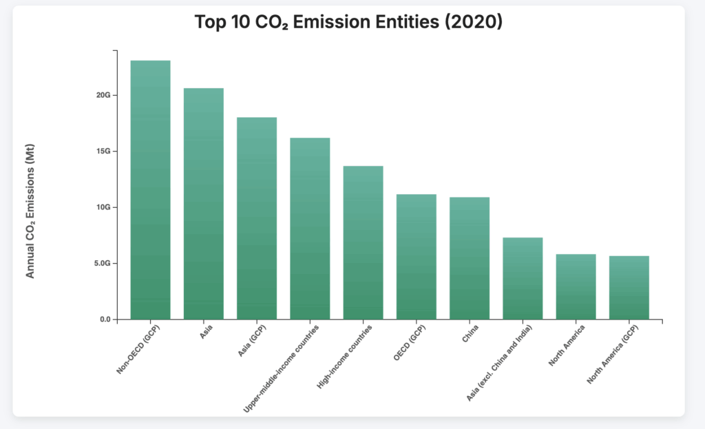
The goal is to visualize the top 10 entities (excluding “World”) by CO₂ emissions. This isn’t a formal project, just a fun, personal exploration and a way to showcase some tools.
I can’t even begin to explain how much I struggled trying to get everything working in Rust, only to end up with less-than-ideal results. (Okay, maybe it’s partially my fault, but still.)
So, today, I’m returning to my comfort zone: D3.js for visualization!
Setup
Start by creating a new Rust project:
cargo new co2_dash
cd co2_dashNext, add the necessary dependencies to your Cargo.toml file:
[dependencies]
polars = { version = "0.38", features = ["lazy", "csv", "is_in"] }
serde = { version = "1.0", features = ["derive"] }
serde_json = "1.0"Your project structure will look like this:
co2_dash/
├── backend/
│   ├── Cargo.toml
│   ├── src/
│   │   ├── main.rs
│   └── data/
│       └── co2_data.csv
├── frontend/
│   ├── index.html
│   └── data/
│ └── top_emitters_2020.jsonThis structure will make it easier to organize both the backend and frontend components, keeping everything neat and manageable.
Data Processing with Rust
Let’s start by processing the data. Our dataset contains some columns we don’t need: Code and Year. We’ll also exclude the “World” entity and filter out any entries with zero CO₂ emissions, as they don’t contribute meaningful insights for visualization.
For this chart, we’ll focus on data from 2020, as we want to visualize emissions for that specific year.
Finally, we’ll sort the data in descending order, prioritizing the highest CO₂ emitters.
use polars::lazy::prelude::*;
use polars::prelude::*;
use serde_json::to_writer_pretty;
use std::error::Error;
use std::fs::File;

fn top_emitters(lf: &LazyFrame, year: i32) -> PolarsResult<DataFrame> {
    let result = lf
        .clone()
        .filter(
            col("Annual CO₂ emissions")
                .gt_eq(1)
                .and(col("Entity").eq(lit("World")).not())
                .and(col("Year").eq(lit(year))),
        )
        .select([col("Entity"), col("Annual CO₂ emissions")])
        .sort(
            "Annual CO₂ emissions",
            SortOptions {
                descending: true,
                ..Default::default()
            },
        )
        .collect()?;

    Ok(result)
}

fn main() -> Result<(), Box<dyn Error>> {
    let lf = LazyCsvReader::new("co2_data.csv")
        .has_header(true)
        .finish()?;

    let df = top_emitters(&lf, 2020)?;

    #[derive(serde::Serialize)]
    struct EntityEmission {
        entity: String,
        annual_co2_emissions: f64,
    }

    let entities = df.column("Entity")?.str()?;
    let emissions = df.column("Annual CO₂ emissions")?.f64()?;

    let mut records = Vec::with_capacity(df.height());
    for (entity_opt, emission_opt) in entities.into_iter().zip(emissions.into_iter()) {
        if let (Some(entity), Some(emission)) = (entity_opt, emission_opt) {
            records.push(EntityEmission {
                entity: entity.to_string(),
                annual_co2_emissions: emission,
            });
        }
    }

    let file = File::create("top_emitters_2020.json")?;
    to_writer_pretty(file, &records)?;

    Ok(())
}We started with a hefty CO₂ dataset, packed with noise, irrelevant years, global totals, and zero-emission entries cluttering things up.
Using Rust and Polars, we cut through the noise, zooming in on 2020 since that’s our focus.
We cleaned the data, sorted it by emissions in descending order, and got it ready to send to the frontend.
{ "entity": "China", "annual_co2_emissions": 10500000.0 }Once we had it, we packed it into a neat JSON file, you can see part of it in the code block above. No clutter, no BS. Just raw, structured data, ready to be picked up by D3.js for visualization.
In-Depth Breakdown
If you like step-by-step explanations, you can find them here, but it’s really just a more detailed breakdown of what we already covered above.
fn top_emitters(lf: &LazyFrame, year: i32) -> PolarsResult<DataFrame> {
    let result = lf
        .clone()
        .filter(
            col("Annual CO₂ emissions")
                .gt_eq(1)
                .and(col("Entity").eq(lit("World")).not())
                .and(col("Year").eq(lit(year))),
        )
        .select([col("Entity"), col("Annual CO₂ emissions")])
        .sort(
            "Annual CO₂ emissions",
            SortOptions {
                descending: true,
                ..Default::default()
            },
        )
        .collect()?;

    Ok(result)
}We started by loading the CO₂ dataset using Polars’ lazy API, which let us create a high-performance query pipeline without executing any actions upfront.
Focusing on 2020, we filtered the data to include only the relevant entries. To clean things up further, we excluded rows labeled “World” and any entries with zero or negative emissions.
After narrowing down to just the Entity and Annual CO₂ emissions columns, we sorted the data in descending order to highlight the top emitters.
fn main() -> Result<(), Box<dyn Error>> {
    let lf = LazyCsvReader::new("co2_data.csv")
        .has_header(true)
        .finish()?;

    let df = top_emitters(&lf, 2020)?;

    #[derive(serde::Serialize)]
    struct EntityEmission {
        entity: String,
        annual_co2_emissions: f64,
    }

    let entities = df.column("Entity")?.str()?;
    let emissions = df.column("Annual CO₂ emissions")?.f64()?;

    let mut records = Vec::with_capacity(df.height());
    for (entity_opt, emission_opt) in entities.into_iter().zip(emissions.into_iter()) {
        if let (Some(entity), Some(emission)) = (entity_opt, emission_opt) {
            records.push(EntityEmission {
                entity: entity.to_string(),
                annual_co2_emissions: emission,
            });
        }
    }

    let file = File::create("top_emitters_2020.json")?;
    to_writer_pretty(file, &records)?;

    Ok(())
}After preparing the data, we converted each record into a structured format and exported it as a clean, easy-to-read JSON file.
This final output is optimized for data visualizations, especially with D3.js, ensuring our workflow stays both efficient and maintainable.
Visualizing
With the JSON file ready, it’s time to bring the data to life. We’ll create an HTML file and build the full project to visualize the top 10 CO₂-emitting countries.
Feel free to split the code into JS, CSS, and HTML files as you would in any frontend project. If you’re familiar with frontend development, you’ll find D3.js straightforward for building these visualizations.
<!DOCTYPE html>
<html lang="en">
<head>
  <meta charset="UTF-8" />
  <meta name="viewport" content="width=device-width, initial-scale=1.0"/>
  <title>Top 10 CO₂ Emitters (2020)</title>
  <link rel="stylesheet" href="styles.css" />
</head>
<body>
  <h1>Top 10 CO₂ Emitters in 2020</h1>
  <div id="chart"></div>

  <script src="https://d3js.org/d3.v7.min.js"></script>
  <script src="script.js"></script>
</body>
</html>The HTML file is quite simple: you define a heading and a div for the chart. It’s also good practice to set the page’s language and character encoding (UTF-8), and later link your JavaScript and CSS files in the HTML.
body {
  font-family: system-ui, sans-serif;
  padding: 2rem;
  background-color: #f9f9f9;
  color: #333;
}

h1 {
  text-align: center;
  margin-bottom: 2rem;
}

#chart {
  max-width: 800px;
  margin: 0 auto;
}We’re not here to explain CSS in detail, but why not do a quick recap? We centered everything on the page, adjusted the chart’s width, added some padding, set a background color, and made a few other styling tweaks to make it look clean and readable.
D3.js Section
// Load the data
d3.json("data/top_emitters_2020.json").then((data) => {
  const margin = { top: 20, right: 30, bottom: 40, left: 150 };
  const width = 800 - margin.left - margin.right;
  const height = 500 - margin.top - margin.bottom;

  const svg = d3
    .select("#chart")
    .append("svg")
    .attr("width", width + margin.left + margin.right)
    .attr("height", height + margin.top + margin.bottom)
    .append("g")
    .attr("transform", `translate(${margin.left},${margin.top})`);

  // X scale
  const x = d3
    .scaleLinear()
    .domain([0, d3.max(data, (d) => d.annual_co2_emissions)])
    .nice()
    .range([0, width]);

  // Y scale
  const y = d3
    .scaleBand()
    .domain(data.map((d) => d.entity))
    .range([0, height])
    .padding(0.1);

  // X Axis
  svg
    .append("g")
    .attr("transform", `translate(0, ${height})`)
    .call(d3.axisBottom(x).ticks(5).tickFormat(d3.format(".2s")));

  // Y Axis
  svg.append("g").call(d3.axisLeft(y));

  // Bars
  svg
    .selectAll("rect")
    .data(data)
    .enter()
    .append("rect")
    .attr("x", 0)
    .attr("y", (d) => y(d.entity))
    .attr("width", (d) => x(d.annual_co2_emissions))
    .attr("height", y.bandwidth())
    .attr("fill", "#2c7be5");

  // Labels
  svg
    .selectAll(".label")
    .data(data)
    .enter()
    .append("text")
    .attr("x", (d) => x(d.annual_co2_emissions) + 5)
    .attr("y", (d) => y(d.entity) + y.bandwidth() / 2)
    .attr("dy", ".35em")
    .text((d) => d3.format(".2s")(d.annual_co2_emissions));
});We begin by loading our JSON file using d3.json(). This file, top_emitters_2020.json, was generated earlier with Rust and Polars.
It contains clean, pre-processed data: the top 10 CO₂-emitting countries of 2020—no noise, no clutter. Once the data is loaded, we dive into the .then() block to start building the chart.
Before anything is drawn, we define the canvas. This involves setting the margin, width, and height, essentially carving out a space for the chart within the SVG.
This margin setup is a standard D3 convention. It provides room for labels and axes, ensuring the chart doesn’t feel cramped in a corner.
Next, we grab the chart container (#chart) and append an SVG element to it. Inside the SVG, we add a <g> (group) element and shift it with transform, ensuring everything fits within the margins we set earlier. This <g> acts as the root of our visual tree.
We then set up a linear x-scale to map CO₂ values across the width of the chart, using d3.max() to adjust the scale and .nice() to round the ticks for a cleaner look. The y-scale is a band scale that vertically stacks the countries, with some padding for visual space.
Next, we add the axes. The x-axis at the bottom shows CO₂ emissions in short formats like “10M,” while the y-axis lists the countries on the left.
With the structure in place, we draw the bars. Starting at x=0, each bar stretches based on emissions. We give them a calm blue color, neatly fitting them into their respective rows.
Finally, we place labels beside each bar, slightly offset for clarity. These labels display the actual emission numbers in a compact, readable format.
Phew, that’s all.
Conclusion
Alright, I’ll admit it, Rust is incredibly powerful, but when it comes to visualization, it can be a bit of a headache. So, I caved and used D3.js for this task. Please forgive me.
This article isn’t meant to be a step-by-step tutorial but more of a look at how to integrate Rust and JavaScript into your workflow. The real question is: did you like the results from combining these tools? And could you see yourself using them for your own projects?
I hope you enjoyed the journey today and that this approach inspires you for future work.